Skip to content Skip to footer

We designed and curated Instagram content for Dayan Media, establishing a strong visual identity aligned with their brand. The tailored theme and consistent aesthetics helped enhance their social media engagement and brand recognition

ClientDayan MediaYear2019AuthorKazem ghafouriShare

Dayan has Aryan roots and means midwife is actually someone who raises a child and then returns it to his parents.


Logo design uses an elliptical form that represents friendship, movement and time, integrity and unity and cooperation and interaction. Most Fermi ratios in the logo follow the golden number (1.618).


The logo uses two predominant colors, blue-green and orange, blue-green has a youthful and vibrant force. The light is closest to the color of the sky and induces a feeling of release.

The orange color complements the blue-green color and the bird-like appearance of Simorgh feather’s, which is on fire. Dynamic color has a sense of adventure, confidence, friendship. This color is a symbol of stimulation and action.

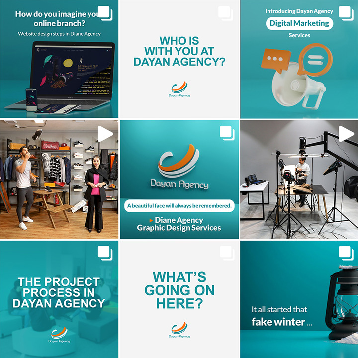
Social Media Branding for Dayan Media

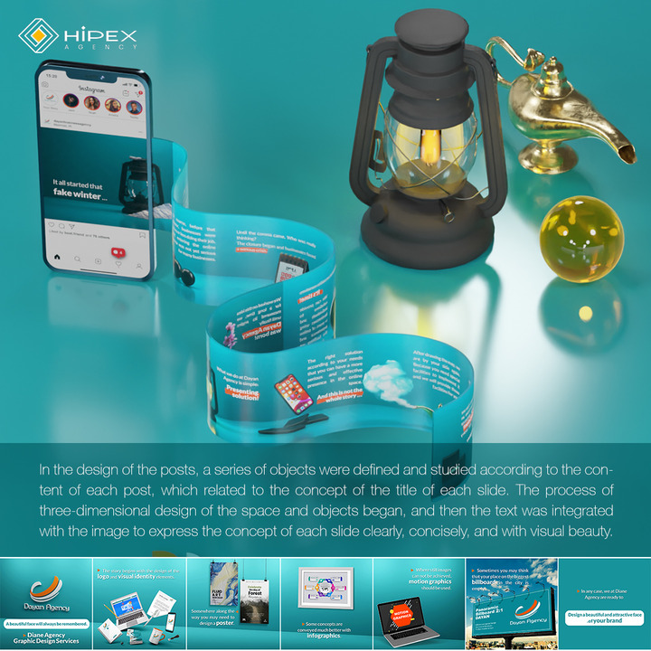
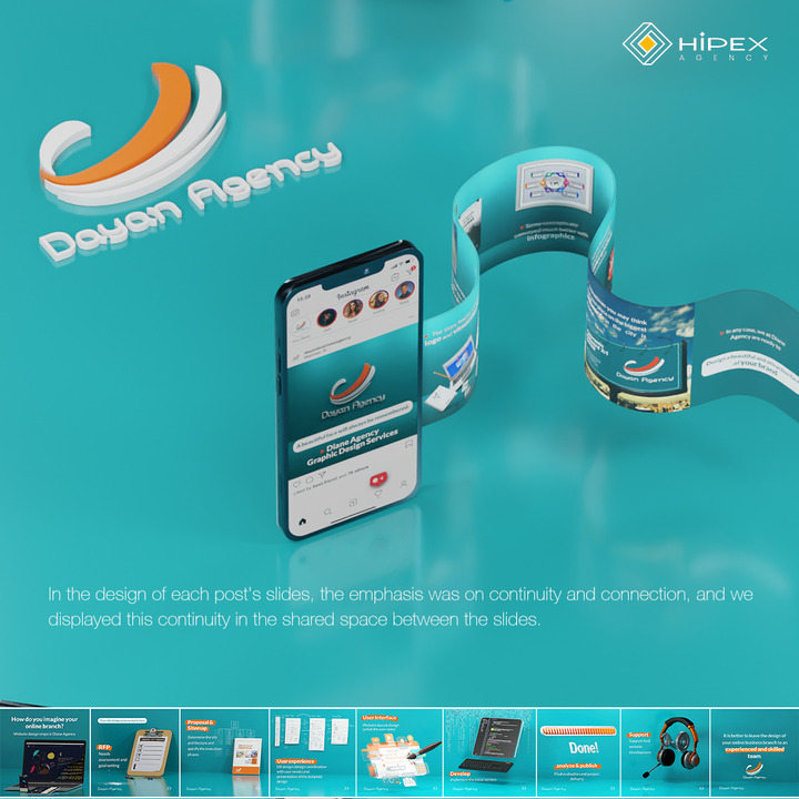
We developed a visually cohesive Instagram presence for Dayan Media, creating a custom theme and consistent content. Our work ensured that the brand’s identity was effectively communicated across all social media platforms.

Leave a comment